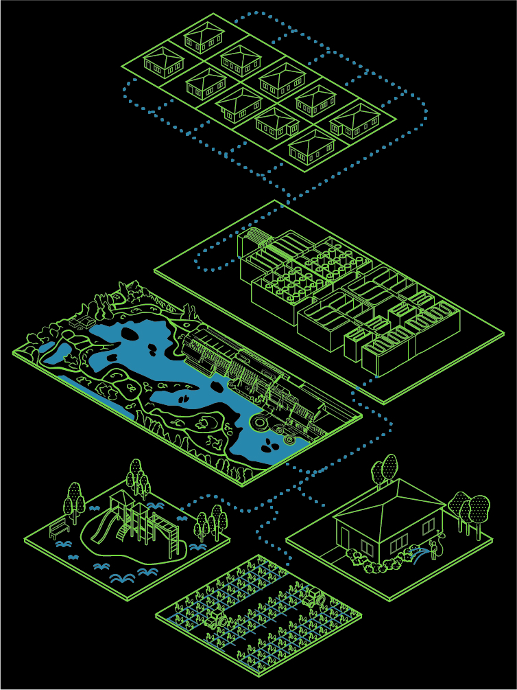
Beauty in Sustainability
A project created to highlight the true beauty of the Donald C. Tillman Water Reclamation Plant located in Van Nuys, LA. It focuses on the sustainable aspect of water recycling as well as how the system is flawlessly integrated into the community in a way that adds value to the area instead of denigrating it. It is composed of a poster that then scans into an augmented reality animated video that goes into detail on the inner workings of the plant.
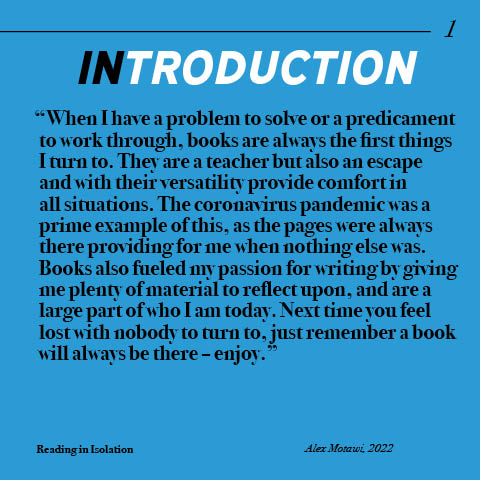
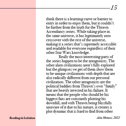
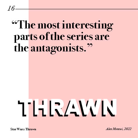
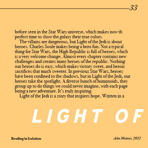
Reading in Isolation
A passion project engineered a way to combine design with reading and writing. It is a book-style collection of book reviews made with the intent to fit them into a book full of 5×5 pages. It was an interesting project as usually graphic elements are a higher priority but when creating books legibility of the text (in which there is a lot of) is the most important. It uses muted colors chosen to allow for the best readability and to establish a calm and comfortable feel so the reader can easily move into a flow state and focus on the copy.
These are just a small portion of the spreads inside the book which contains a small fraction of the book reviews I’ve written on books read during the covid pandemic – hence the name and theme of the book. Please contact me if you are interested in seeing more.


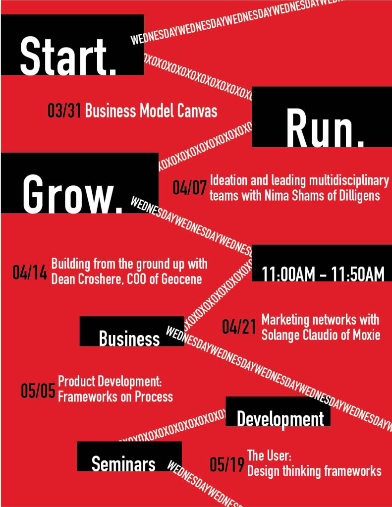
Poster Redesign
Two iterations and then the final iteration of a project where I redesigned an already existing poster for the UC Davis student startup center. While the first two iterations are in no way complete, I always love to see the thought process of designers and the wealth of ideas they drafted, and I thought their contrast with the final poster was interesting. The black and red in the final poster is really eye-catching and dynamic to draw the eyes of passersby and entices entrepreneurs with the Start. Run. Grow. slogan while the white contrast makes the dates readable.


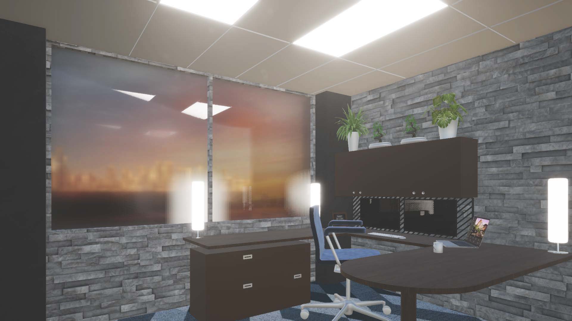
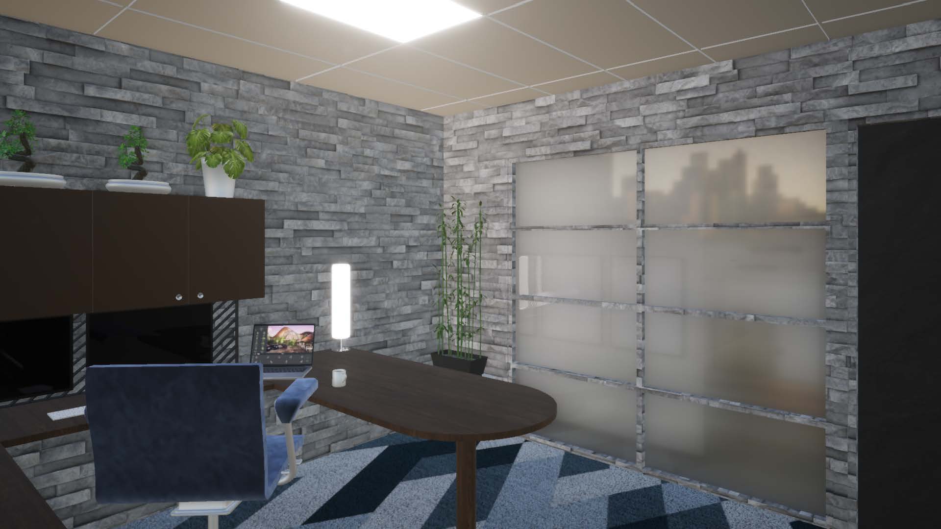
Office Render
This is a project where I modeled an office in a 3D program and then ported it to a rendering software in order to further texture the office space in preparation to render the pictured images. Created to have more a homely feel with the walls and flooring but to retain enough typical features of general office buildings to not look out of place inside an office complex. Enough personality to stand out in a good way, which is often a subtle balance.
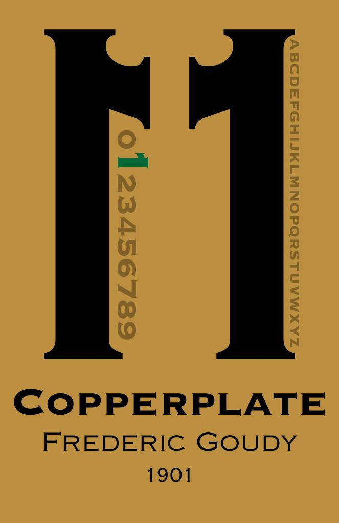
Type Poster
This is a poster specifically designed to show off the font Copperplate and really show the audience the use-case and general feeling of the font. It uses colors reminiscent of old-time ornate buildings and mirrors the black and gold name tags often found in their offices, which was a primary use of the font. The main graphic element is two numbers from the font that coordinate to give a more official and formal feel to create an architectural form similar to official buildings. The emerald one is a sign as to what number the arches are constructed from and gives a vibrant point that catches the eye of the audience and is an eccentricity that keeps their attention while adding personality to the piece.
